Refugee Artisan Initiative
This non profit caters to mostly refugee women from all over the world, they support these women by giving them training and tools to self sustain. Being an immigrant myself I partially resonate with what they might go through moving to a new country and starting from scratch. I volunteered with them to redesign their site and fix some key issues.
Product Preview
 |  |  |  |
|---|
Problem Statement
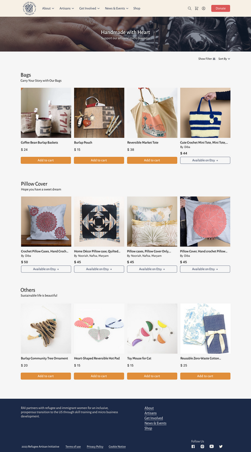
The existing site was cluttered with a confusing information architecture. The were redundant menu items and the ecommerce layout had the issue of sending users to a different website.
Constraints:
-
Limited project timeline, just 10 weeks.
-
Limited access to target audience
Goals
-
Maximizing existing brand colors, fonts and style..
-
Creating a simpler information architecture.
-
Improving the discovery of the e-commerce functionality
-
Improving visibility of donation CTA
My Role
Design - Wireframing and prototyping the homepage and e-commerce layout
Research - Competitor analysis and usability testing
Research and Analysis
Our team of 3 conducted an extensive competitor analysis for this nonprofit organization, which uniquely relies on donation prompts and integrates e-commerce for support. This positioning places the organization in a distinct and interesting situation within its sector.
Existing site map

Conducting Competitor Analysis


Card Sorting

New site map

Design and Testing
As research was through, lofi mockup and brain storming sessions resulted in a solid clear design approach. We ensured to follow the brand style principles and conducted user interviews for our lofi mockups
Homepage

Critical issue with the E-commerce layout :
-
The organization sells its handmade products on its website and Etsy.
-
Clicking on a product may unexpectedly redirect users to Etsy.
-
Etsy opens in a new tab, causing users to bounce out of the organization's site.

2 Solution Approaches : Since this org is unique in it's e-commerce approach we designed 2 possible solutions. We conducted A/B testing to make the design decision
Store Page

Solution 1 : Having a separate tab to distinguish between the Org's products and the products sold on Etsy
Solution 2 : Having to mention right below the product saying "Available on Etsy"

"I like that I can see all the products sold at once" ~ User quote

Solution 2 Prevails!. Our testing proved that 8 out of 10 users preferred Solution 2
Results and Takeaways
Positives:
-
Usability test scores showed a 3 fold increase in user satisfaction, site feel, and function.
-
Discoverability of the donation prompt improved by 20%.
-
The nonprofit has made progress in sorting out the information architecture.
Negatives:
-
The nonprofit lacked the necessary funds to implement all the recommended changes at the time.
Takeaways
-
Working with non profits that truly brings life changing impact and supporting them with my skillset has been an enriching experience
-
Doing the best with the constraints in place has taught me valuable lessons and has improved my design and research approach